
Add Colours While You Work From Home
Colour has a profound influence on an object, interior spaces and people. It is often the most challenging part of a room to get right. People are usually afraid to use strong colours and would opt for safer white or muted tones. Yet the natural world is full of exciting and energizing colours. With so many shades to choose from, we just need to blend various colours in the right proportions to harmonize each other.
Colors and Emotions
Since colours evoke an emotional reaction especially in your home, it is important to understand how they affect you. As people respond to colours differently, they can create strong likes and dislikes. Some may consider blue as a depressing colour, while others recall the wide ocean. Some might see green as an envious, jealous colour, while it reminds others of the natural world.
Take your personal feelings into account but also consider the natural light in the room as well. You may want a bright, cheerful yellow kitchen, but if your kitchen is already strongly lit with sun, painting the walls yellow might be a little overwhelming. So, how do you decide what colours are suitable for you and your space?
Luckily, there are a few colour rules that ensure your colours look balanced throughout. We have listed below some simple guides to help you decide on colour combinations. Use them to understand how you can create an inviting, productive space in your home.
Warm vs. Cool Colours
Colour is divided into two categories: warm and cool tones. Shades like red, orange and yellow are warm colours because they are more vibrant and can energize a space and its occupants. Neutrals like brown and tan are also included in this mix. Cool tones such as blue, green and purple generally create quiet, relaxing moods.
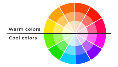
The choice of warm or cool colours will affect the ambience and perception of the space. Since warm colours tend to create an upbeat and welcoming feel, they are best applied in spaces to entertain. Cool colours, on the other hand, are more subdued.
If you aim for a classic yet mysterious bathroom, opt for dark warm shades such as our design below.
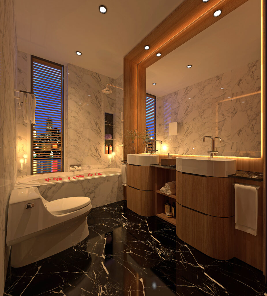
Image Credits: Winstudio Architects
But if you prefer a peaceful, calming space like this bathroom design, decorate in blue and cream using soft, soothing shades.
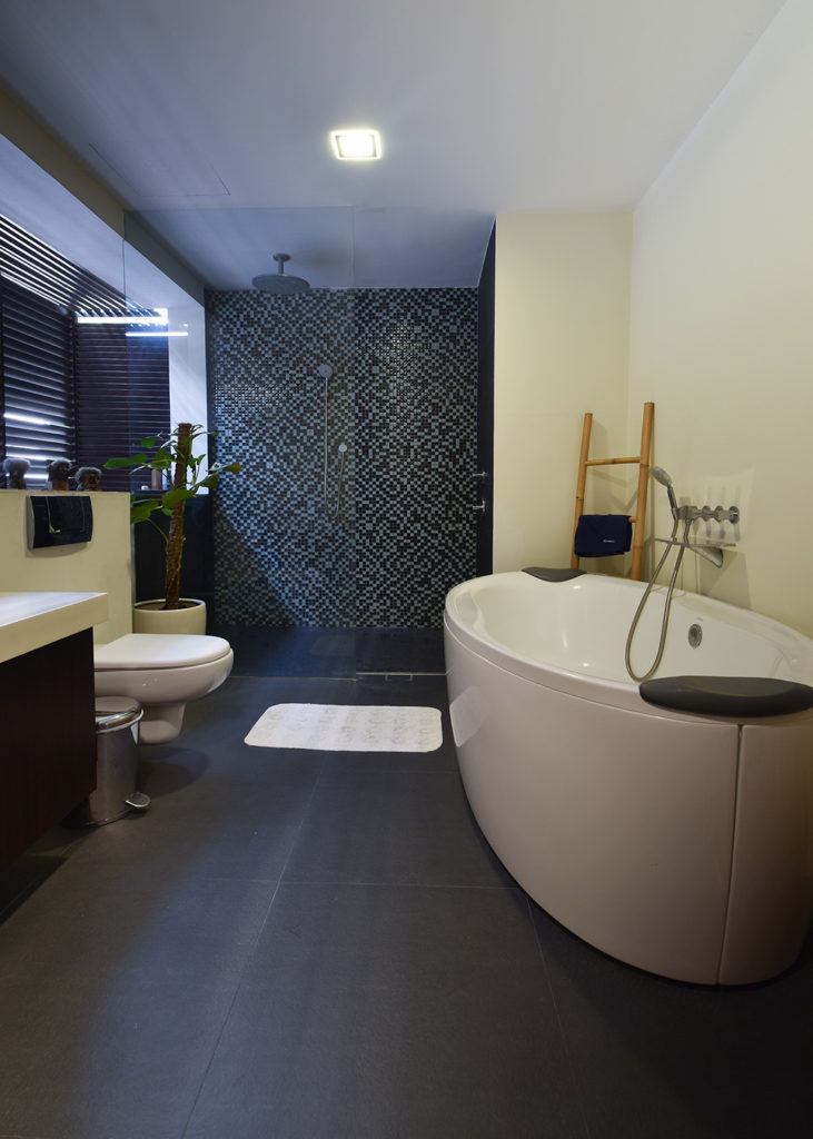
Image Credits: Winstudio Architects
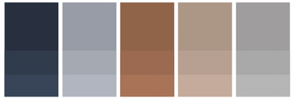
The Complementary Colour Scheme
Of all the colour rules that interior designers use, the complementary colour scheme is often the simplest as it only involves two shades that are sitting directly opposite each other on the colour wheel.
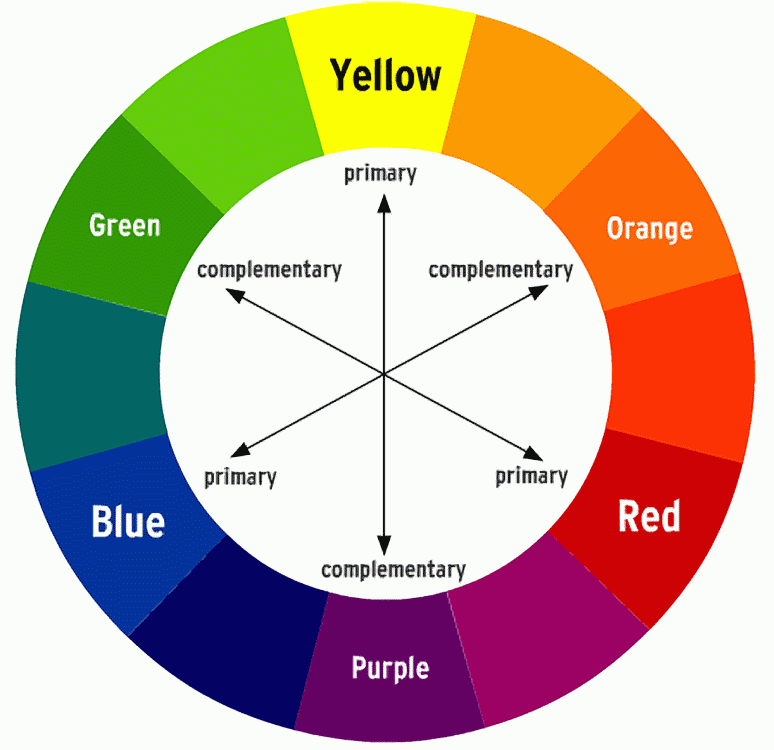
Complementary Colour Scheme Chart
In complementary colour scheme, you get combinations like blue and orange, yellow and purple or red and green. As seen from the photo above, these colour pairings are extremely high contrast and bring a strong energy into the space. So they are best used in small doses or accent colours. Use plenty of neutrals to balance out and to provide a place for your mind to rest.
For example, these neutrals are suitable if you choose:
- Yellow and purple: Add white or brown as neutrals
- Orange and blue: Select black or white as accents or neutrals
- Red and green: Opt for gold or silver for accents
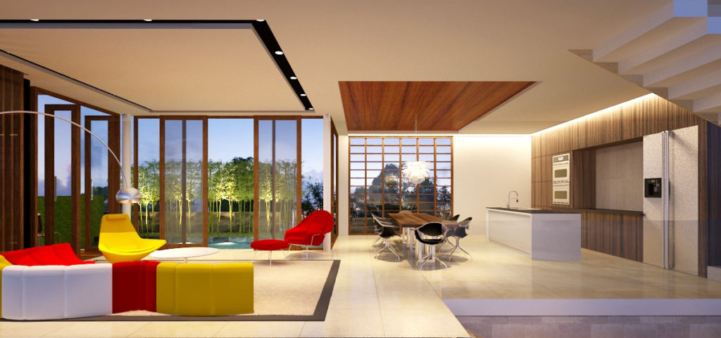
Use complementary colours for bold design choices in your home. For example, if you use purple as shown in this photo, use yellow accents such as furniture or wall art. Because purple and yellow are opposite one another, they will complement and highlight each other without competing for your eye.
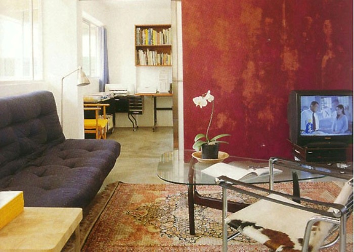
Image Credits: Winstudio Architects
The Analogous Colour Scheme
If you have trouble navigating the colour wheel, an analogous colour scheme might suit you. In this scheme, all you need to do is pick a central colour, then also use the colours on either side of it. In the analogous colour chart below, green is the central colour and blue and yellow are the supporting colours that combine together.
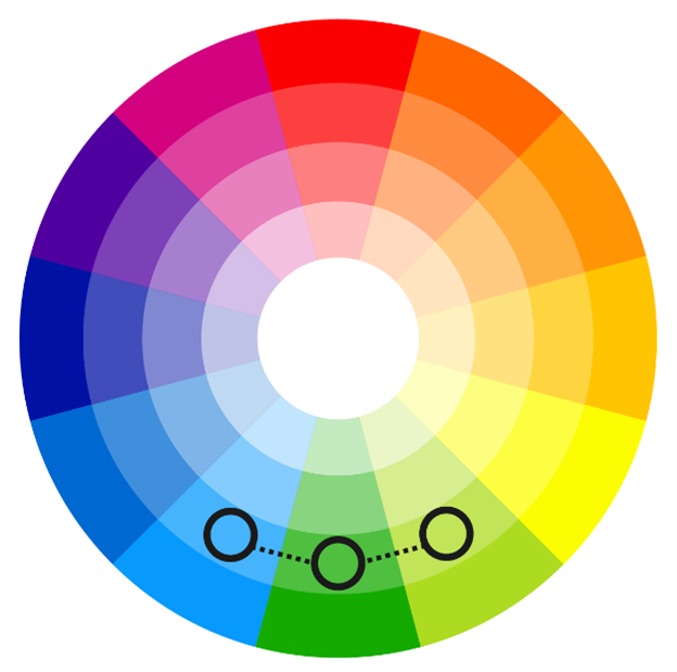
When using this technique, having a sense of colour proportion is needed to make sure the space feels balanced. For example, you may use brown as the main colour in larger proportion compared to green and yellow. Or you can use different shades of the same colour to create visual variety.
Photo Credits: Winstudio Architects
And if you are not big on vibrant hues, consider neutrals to create an analogous colour scheme. This is typically called the monochromatic colour scheme. Here, all you need is to blend black, white and gray or brown colours into harmonious tones.
Analagous Colour Scheme Chart
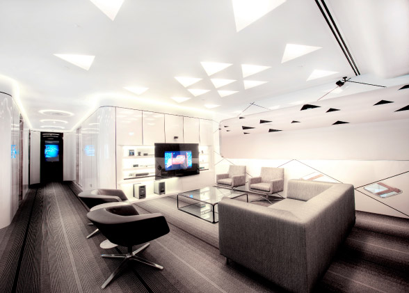
Photo Credits: Winstudio Architects
Rule of Three
The rule of three is similar to the three-colour selections made in the analogous colour scheme, but you don’t need to use the colour wheel to determine the three colours you use.

Photo Credits: Winstudio Architects
The rule of three achieves an interesting and balance décor. It’s all about using odd numbers, which don’t stop at three so you can have any odd numbers to be used in combinations. However, three seems to be the optimal number when applying the rule to interior design.

Photo Credits: Winstudio Architects
Working with Three Colours
When following the rule of three, you select three colours to use within your colour scheme. You may want to refer to the analogous colours or complementary colours with an accent colour choice added. The choice is yours, as any such combination can work when you are applying the rule of three.
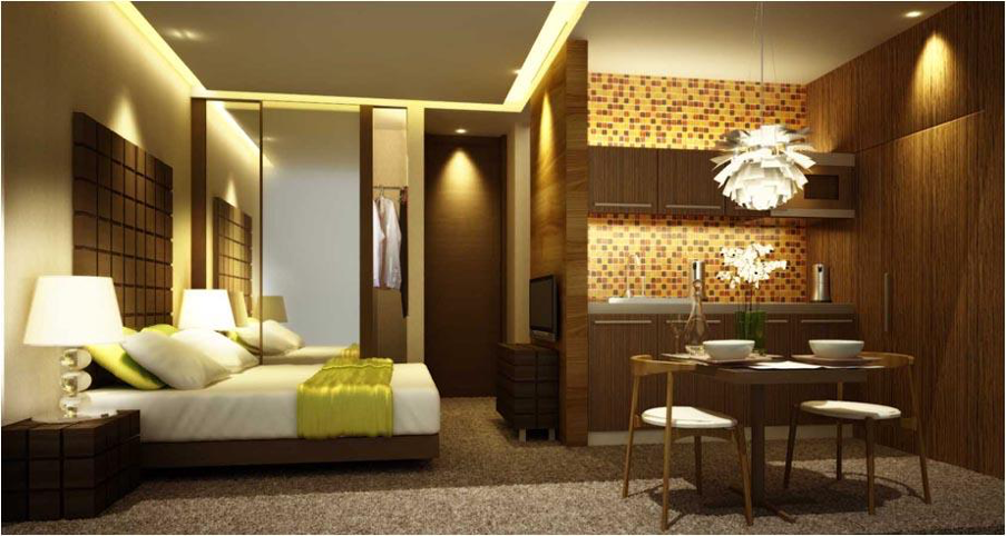
Photo Credits: Winstudio Architects
60-30-10 Colour Rule
This is a classic decor rule that helps create a colour palette for any space. In this case, 60% of the room should be a dominant colour, 30% should be the secondary colour or texture and the last 10% should be an accent. Apply the 60-30-10 rule for a balanced colour selection.
Examples include:
- Green (60%), yellow-green (30%) and yellow (10%)
- Yellow-orange (60%), orange (30%) and red-orange (10%)
- Blue-green (60%), blue (30%) and blue-purple (10%)
- Purple (60%), red-purple (30%) and red (10%)
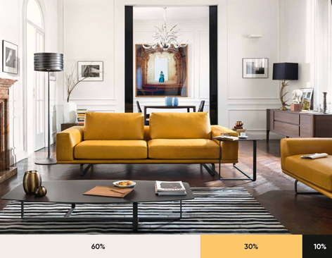
Image Credits: blog.prototypr.io
Go with your Colour Flow
To summarize, choosing your favorite colours make a great start in firing off your imagination. Once you have decided a colour scheme for the main room in your home, imagine how it looks and how you feel in the space. Try pairing it with its complementary colour or an analogous colour to see the effect. You may even use the 60-30-10 rule if you are confident.
To spice up your home even further, you can add new colours to the main colour when moving from one room to the next. Pay attention to what the space is telling you and how it changes from day to night. Tone up or down the colour or temperature to enhance the room. This strategy will keep your décor flowing and cohesive without being too similar in every room.
Use paint samples and fabric swatches provided by your interior designer or supplier. Try them on for several days to see the effect of light and shadow. Remember that colour isn’t permanent, and can frequently be changed, but getting it right the first time is very satisfying.